THE AGATHA CHRISTIE FESTIVAL

Giving an iconic literary legacy a bold new chapter

OUR WORK > THE AGATHA CHRISTIE FESTIVAL​

Brand identity, creative campaign design and visitor materials

Agatha Christie’s stories have captivated generations of readers around the world.

Born in Torquay, her connection to the English Riviera remains an important part of the area’s cultural heritage and is celebrated through the International Agatha Christie Festival.

The festival already had a loyal following, but its organisers wanted to introduce Christie’s work and legacy to a broader, younger audience.

We created a distinctive new identity that balanced her timeless appeal with a bold, contemporary style, bringing fresh energy to the festival and helping visitors explore her story across Torbay.

The result was a recognisable and flexible visual identity that could take the Queen of Crime into a new chapter without losing sight of the past.

Agatha Christie Festival- Frankman Design Marketing Torquay Portfolio AGATHACHRISTIE VISUALS 4 - Agatha Christie Festival - DuoDot
Agatha-Christie-Frankman-Design

The project at a glance

Client: The Agatha Christie Festival
Sector: Arts, culture, literature and tourism
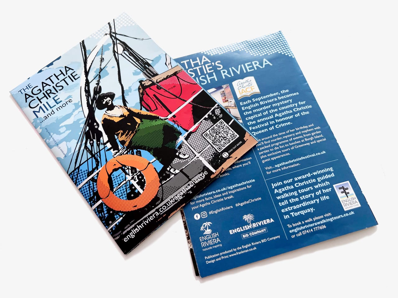
Support: Brand identity, logo design, bespoke imagery, posters, festival publications, exhibition materials, flags, leaflets and visitor map
Goal: Engage a new generation of Agatha Christie fans while celebrating her heritage and connection to Torquay

Agatha Christie Festival- Frankman Design Marketing Torquay Portfolio AGATHACHRISTIE VISUALS 10 - Agatha Christie Festival - DuoDot
Agatha Christie Festival- Frankman Design Marketing Torquay Portfolio AGATHACHRISTIE VISUALS 7 - Agatha Christie Festival - DuoDot
Agatha Christie Festival- Frankman Design Marketing Torquay Portfolio AGATHACHRISTIE VISUALS 8 - Agatha Christie Festival - DuoDot

A timeless legacy that needed a fresher visual story

The Agatha Christie Festival celebrates the life, work and enduring influence of one of the world’s best-loved authors.

With an established following of dedicated Christie fans, the festival already had a strong foundation. However, the organisers wanted to make sure her legacy continued to capture the imaginations of future generations.

The existing visual presence needed greater energy and consistency.

It had to appeal to people already familiar with Christie’s novels while also catching the attention of younger audiences who might only just be discovering her characters and stories.

The challenge was to create something fresh and contemporary without disconnecting the festival from the history and heritage that made it so special.

This wasn’t about changing Agatha Christie.

It was about presenting her familiar story in an unexpected new way.

Finding the balance between heritage and reinvention

Working with an internationally recognised literary figure required a careful creative balance.

The identity needed to feel distinctive and modern, but it also had to remain respectful of Christie’s legacy and instantly recognisable to her existing fans.

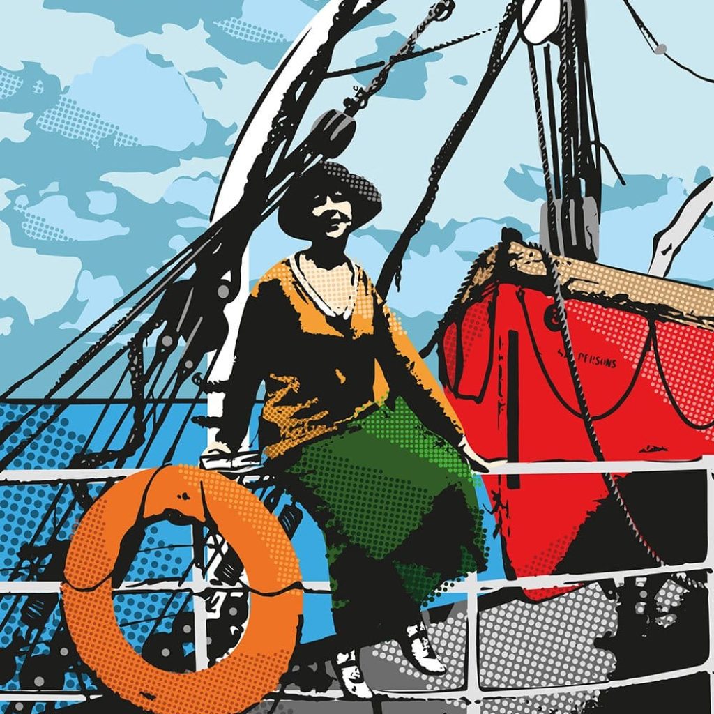
We moved away from the more traditional visual style often associated with historical and literary events and explored a bolder, pop-art-inspired direction.

This gave the festival a contemporary personality while keeping Agatha Christie firmly at the centre of the story.

The new visual approach created an intriguing contrast: one of the world’s most iconic authors presented through vibrant colours, confident compositions and striking modern imagery.

It felt unexpected, but still unmistakably Agatha.

Agatha-Christie-Frankman-Design
Agatha Christie Festival- Frankman Design Marketing Torquay Portfolio AGATHACHRISTIE VISUALS 5 - Agatha Christie Festival - DuoDot
Agatha Christie Festival- Frankman Design Marketing Torquay Portfolio AGATHACHRISTIE VISUALS 4 - Agatha Christie Festival - DuoDot

Creating a new image for the Queen of Crime

Using a black-and-white photograph of Agatha Christie as the starting point, we developed three bold colour treatments that transformed the familiar portrait into a versatile set of contemporary visuals.

Each image retained Christie’s recognisable presence while introducing more energy, colour and impact.

The artwork was designed to work across a wide range of materials, including posters, publication covers, exhibition displays and festival flags.

This flexibility allowed the festival to create variety across its communications while maintaining a consistent and instantly recognisable identity.

Whether seen on a poster, across an exhibition or flying above a festival venue, the imagery helped Agatha Christie stand out in a completely new way.

Creating an identity the festival could make its own

Alongside the campaign visuals, we were entrusted with creating the official festival logo and wider branding.

The identity needed to provide a strong foundation that could support different events, venues and activities while holding everything together as part of one festival.

We developed a cohesive visual style that could be adapted across printed and digital communications without losing its impact.

The logo, colour palette and portrait treatments worked together to create a clear and recognisable presence, giving the festival the tools it needed to promote each year’s programme with greater confidence and consistency.

Rather than relying on individual pieces of artwork, the festival now had a visual identity it could continue to build upon.

Agatha Christie Festival- Frankman Design Marketing Torquay Portfolio AGATHACHRISTIE FLAG 1 - Agatha Christie Festival - DuoDot
Agatha-Christie-Frankman-Design
Agatha Christie Festival- Frankman Design Marketing Torquay Portfolio AGATHACHRISTIE VISUALS 3 - Agatha Christie Festival - DuoDot
Agatha Christie Festival- Frankman Design Marketing Torquay Portfolio AGATHACHRISTIE VISUALS 6 - Agatha Christie Festival - DuoDot
Agatha Christie Festival- Frankman Design Marketing Torquay Portfolio AGATHACHRISTIE VISUALS 12 - Agatha Christie Festival - DuoDot

Turning local history into something visitors could explore

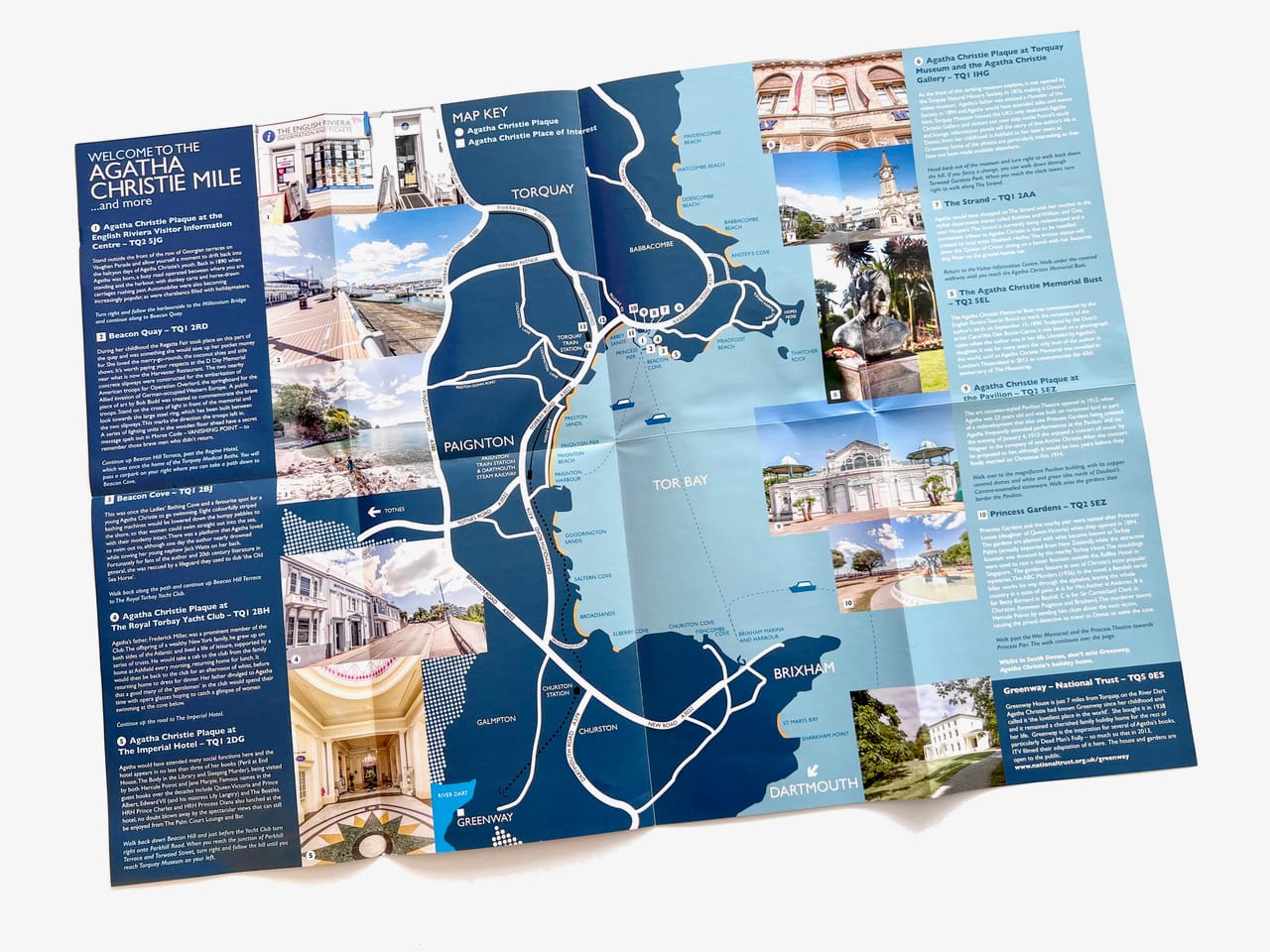
The festival also wanted to encourage more people to discover the Agatha Christie Mile.

The route connects locations across Torbay associated with Christie’s life and legacy, giving visitors the opportunity to explore her story within the town where she was born.

We designed and printed an engaging fold-out map that made the route easier to understand and follow.

The map combined practical directions with a visually appealing design, helping visitors identify the key locations and feel more connected to the stories behind them.

Supporting promotional leaflets encouraged people to explore the route and discover more about Agatha Christie’s relationship with Torquay.

This transformed the Mile from a collection of individual locations into a more joined-up visitor experience.

“They really understood what I wanted to create and brought it to life in a way that feels completely ‘me’.”

What changed

A bolder, more contemporary identity
The new logo, vibrant colours and pop-art-inspired portraits gave the festival a distinctive visual presence designed to connect with existing fans and new audiences.

Greater consistency across the festival
Posters, publications, exhibition materials, flags and promotional pieces began working together as part of one recognisable identity.

A more engaging visitor experience
The fold-out Agatha Christie Mile map made it easier for visitors to explore the locations connected to Christie’s life and discover more of her Torquay story.

Agatha-Christie-Frankman-Design
Agatha Christie Festival- Frankman Design Marketing Torquay Portfolio AGATHACHRISTIE VISUALS 3 - Agatha Christie Festival - DuoDot
Agatha Christie Festival- Frankman Design Marketing Torquay Portfolio AGATHACHRISTIE VISUALS 6 - Agatha Christie Festival - DuoDot
Agatha Christie Festival- Frankman Design Marketing Torquay Portfolio AGATHACHRISTIE VISUALS 12 - Agatha Christie Festival - DuoDot

A fresh chapter for an enduring story

The Agatha Christie Festival emerged with a visual identity that felt bold, relevant and full of energy.

The contemporary portrait treatments gave the organisers a flexible collection of imagery that could be used across the festival, while the logo and supporting visual style brought greater consistency to its communications.

The Agatha Christie Mile map also helped extend the experience beyond individual events, inviting fans to step into Christie’s world and explore her connection to Torbay for themselves.

Most importantly, the new identity demonstrated that celebrating literary heritage doesn’t have to mean looking backwards.

Agatha Christie’s stories remain timeless. The festival’s new look helped introduce them to a new generation.

Does your established brand need a new chapter?

A long history and a loyal audience are incredibly valuable, but they shouldn’t prevent your organisation from evolving.

The right creative approach can introduce fresh energy, reach new people and make an established story feel relevant again without losing everything audiences already recognise and value.

If your brand has an important past but needs a stronger presence for the future, let’s talk it through.

Let's discuss your project

Tell us what’s happening, what you’d like to improve or what you’re trying to achieve.

We’ll help you find the most useful next step.