REGOLA DIGITAL CONSULTING

Building a brand that inspires confidence and starts conversations

OUR WORK > REGOLA DIGITAL CONSULTING

Rebranding, printed materials and interactive exhibition design

Regola Digital Consulting helps businesses make sense of cyber security, improve their protection and work towards Cyber Essentials certification.

Their expertise was there, but their existing branding wasn’t communicating it clearly. They wanted a more professional, trustworthy identity that better reflected the business behind it.

We helped Regola refresh their brand and bring it to life across leaflets, flyers, coasters and exhibition displays. We also created an interactive wheel that gave visitors a different way to explore Cyber Essentials and start a conversation with the team.

The result was a consistent identity and a collection of practical marketing materials that Regola continues to use at events.


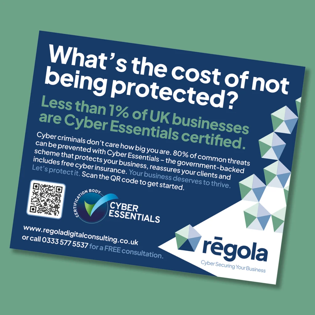
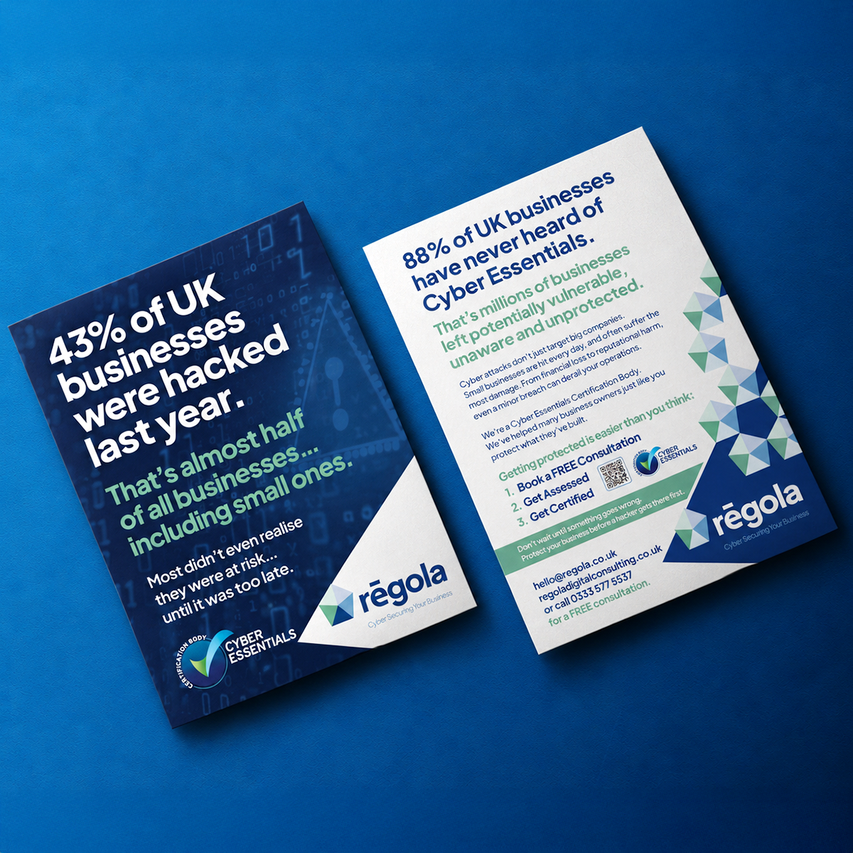
Front and back of Regola’s cyber security leaflet, featuring the refreshed branding and Cyber Essentials information.
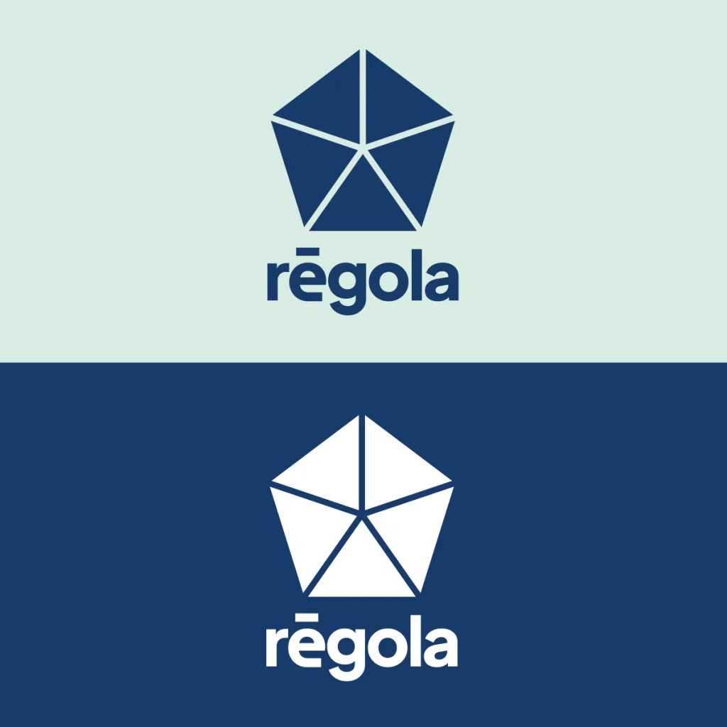
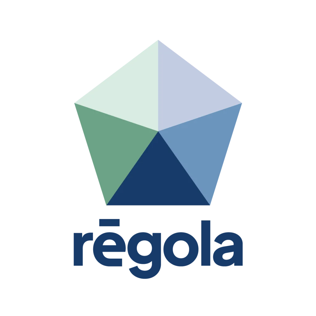
Refreshed Regola logo with a faceted blue and green geometric symbol above the company name.
Regola logo variations showing a dark blue logo on pale green and a white logo on dark blue.

The project at a glance

Client: Regola Digital Consulting
Sector: Cyber security and digital consulting
Support: Rebranding, logo design, leaflets, flyers, branded coasters, exhibition banners and an interactive exhibition activity
Goal: Create a more professional and trustworthy identity, clarify what Regola does and help the team engage potential customers at events

Original Regola Digital Consulting logo above the refreshed geometric logo and “CyberSecuring Your Business” strapline.
Two Regola team members seated beside a screen displaying the refreshed company logo.
Regola A6 advert with the headline “What’s the cost of not being protected?”, a QR code and blue and green branding.

Expertise that deserved a clearer first impression

When people are looking for help protecting their business, confidence in the people giving that advice matters.

Regola’s existing identity wasn’t doing justice to their expertise. The stylised lettering was difficult to interpret, and the overall design felt dated and unclear about what the business offered.

They needed a brand that helped people recognise them, understand their area of expertise and feel comfortable approaching the team.

That meant creating a more professional appearance while keeping the business approachable, particularly for people who might find cyber security unfamiliar or intimidating.

Giving the identity a clearer shape

We kept Regola’s existing colour scheme, retaining a connection to the original brand while developing a new visual direction.

A faceted pentagon became the central symbol, paired with clearer, more legible lettering. The combination gave Regola a distinctive identity that could be recognised at different sizes and used across a wide range of materials.

From a small coaster to a large exhibition banner, the new design gave everything a consistent starting point.

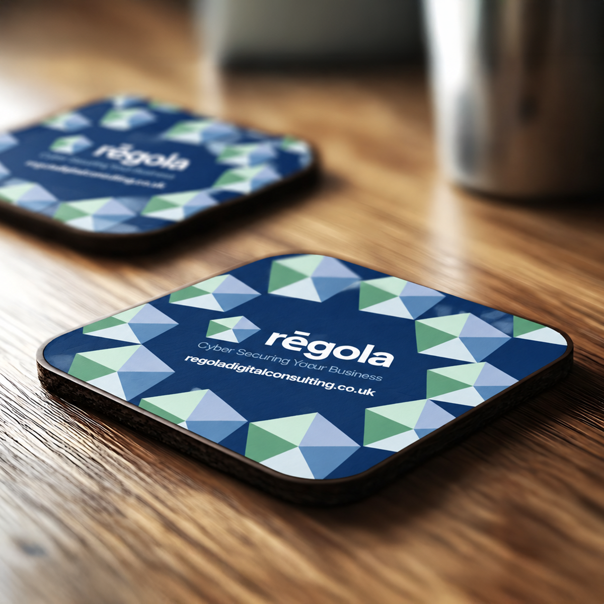
Regola branded coasters featuring the new logo and a blue, green and white geometric pattern.
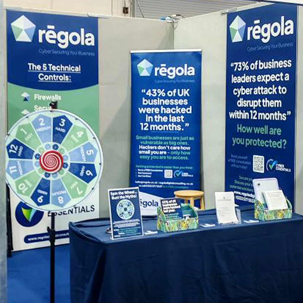
Regola exhibition stand with branded banners, a cyber security spinning wheel and printed marketing materials.
Navy and white polo shirts embroidered with the refreshed Regola logo.

Bringing the brand into everyday marketing

With the new identity in place, we developed leaflets, flyers and branded coasters to support Regola’s promotional activity.

The aim was to make each piece feel part of the same business, wherever someone encountered it.

Printed materials gave the team something to share during conversations and leave with potential customers. The coasters brought the brand into a useful everyday item, while the exhibition banners carried the identity into larger spaces.

Together, these materials gave Regola a coordinated presence for meetings, promotions and events.

Putting a new spin on cyber security

An exhibition stand needs to give people a reason to stop.

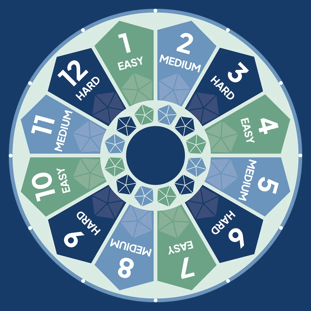
For Regola, we created an interactive wheel that invited visitors to take a spin and explore a myth or fact about Cyber Essentials.

It was a simple way to make a technical subject more approachable. Visitors didn’t need specialist knowledge to take part, and each spin gave the team an opening to explain an issue, answer a question or talk about a common misconception.

Designed to work alongside the exhibition banners and printed materials, the wheel brought the refreshed brand into an activity people could join in with.

It also gave Regola something they could use again, with the wheel and displays going on to appear at further events.
Square Regola coaster design with a central logo surrounded by a blue, green and white geometric pattern.
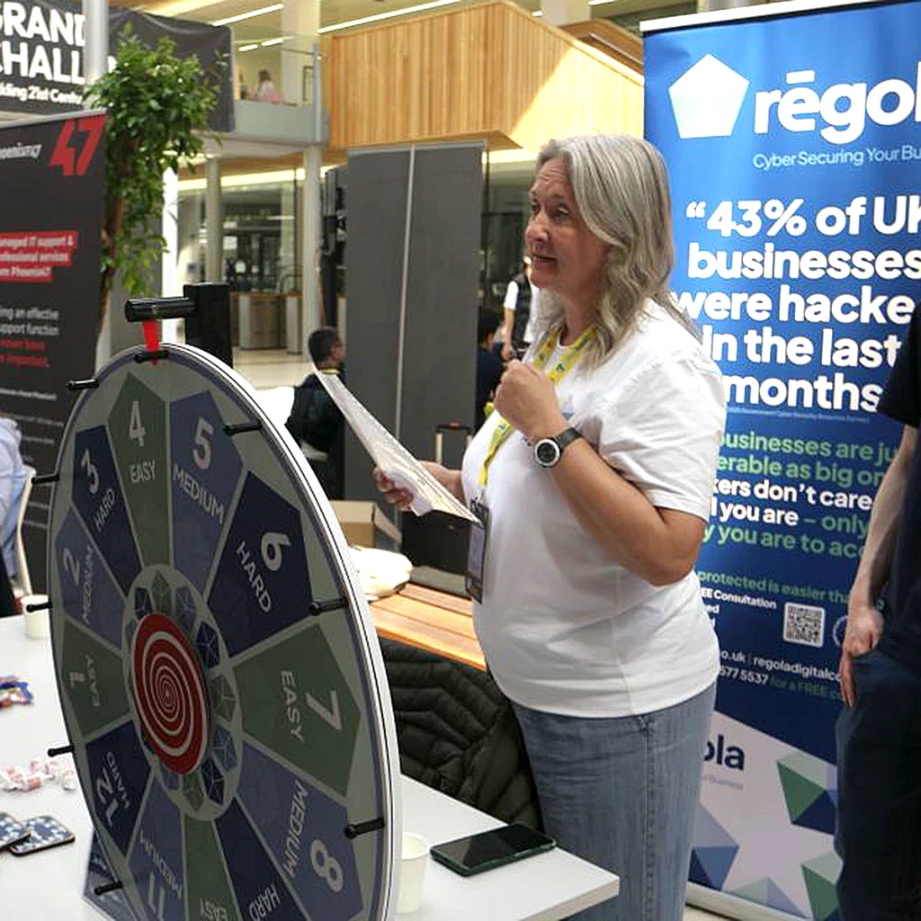
Woman standing beside Regola’s blue and green cyber security spinning wheel at an exhibition.
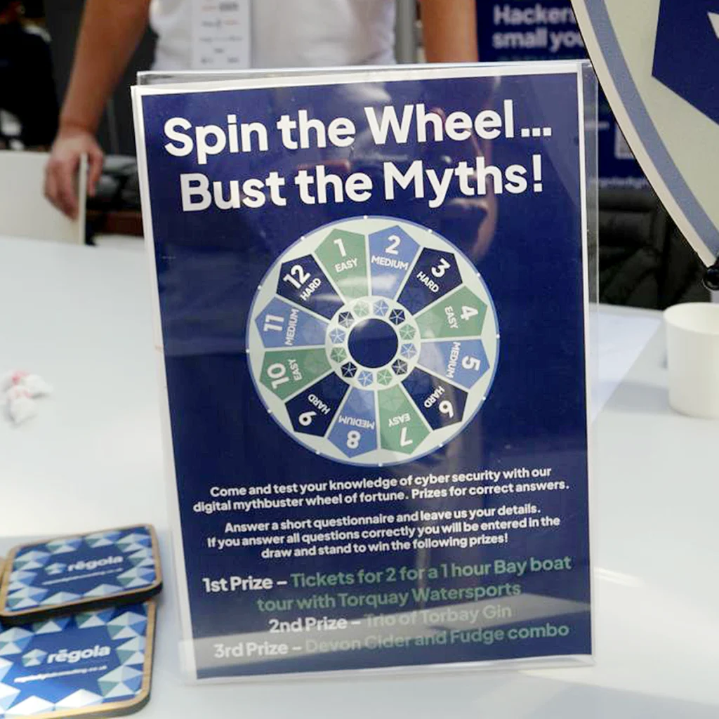
Blue and green numbered spinning wheel designed for Regola’s interactive cyber security exhibition activity.

What changed

A clearer, more professional identity
The new logo replaced the difficult-to-read lettering with a distinctive symbol and clearer typography, giving Regola a stronger visual foundation.

Consistent materials across different settings
Leaflets, flyers, coasters and exhibition displays now share the same identity, helping the business present itself consistently.

An approachable way to start conversations
The interactive wheel gave the team a practical way to introduce Cyber Essentials through participation, questions and discussion.

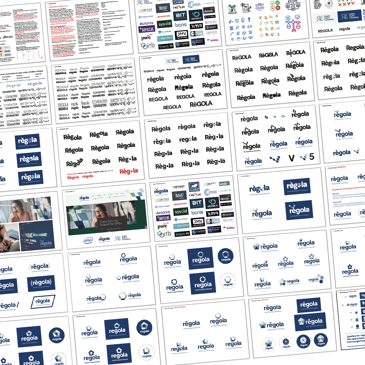
Collection of Regola logo concepts exploring typography, symbols and colour combinations during the rebrand.
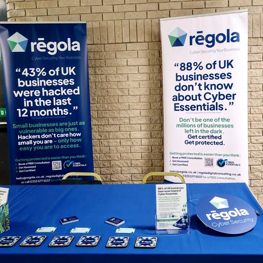
Regola event display with two roll-up banners, printed leaflets and branded coasters arranged on a blue tablecloth.
Two Regola team members wearing navy and white branded polo shirts in front of an exhibition banner.
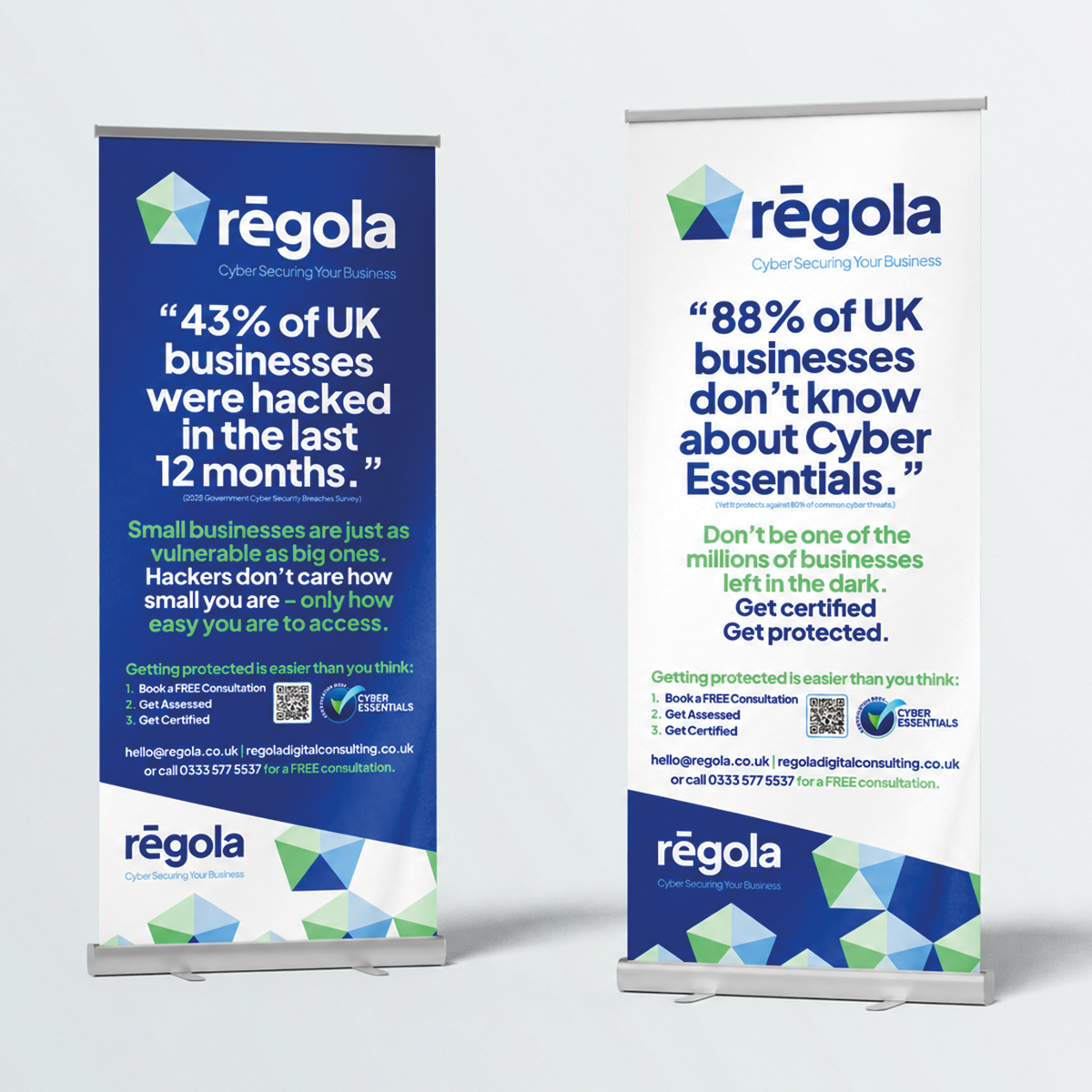
Two Regola roll-up banners highlighting cyber security risks and Cyber Essentials certification.
Regola tabletop display featuring the spinning wheel and the message “Spin the Wheel – Bust the Myths!”
Exhibition visitor taking part in Regola’s cyber security spinning wheel activity beside a branded banner.

A brand that keeps working beyond the first event

Regola has continued to use the wheel and exhibition displays at subsequent events, extending the value of the work beyond its first outing.

Following one exhibition, the team shared that they had enjoyed plenty of conversations and received positive comments about the branding and design throughout the day.

The project gave Regola both a refreshed identity and a set of useful materials to support how they meet people and introduce their services.

“Special shout out to DuoDot Ltd for our amazing branding and design. Lots of positive comments all day!”

Emily Godowski
Regola Digital Consulting via LinkedIn

Is your brand giving people the confidence to trust you?

You know your business delivers. But does the first impression you make reflect the expertise behind it?

If your branding feels dated, your materials look disconnected or people struggle to understand what you do, we can help bring things into focus.

Together, we’ll create a clearer identity and practical marketing materials that help you introduce your business with confidence.

Let's discuss your project

Tell us what’s happening, what you’d like to improve or what you’re trying to achieve.

We’ll help you find the most useful next step.